Showing posts with label art. Show all posts

Sunday, March 4, 2012

on being crafty.

lately, and luckily, for the past few months i've been feeling extremely crafty and have made time for my creative expression. here's a glimpse at what's been going down.
 my germany scrapbook has been getting a lot of love. i'm actually scrapping march of 2011, so not too far behind. except i still need to scrap italy...in an entirely separate book. 

 i felt very crafty at christmas. kate [step-mama] got a kitchen aid mixer painting. 
of course i took no picture of the end result, but it was very, very adorable.

 laycee + kevin recieved mini painting magnets for christmas.
i found cute 3x3 canvas squares at michael's and aaron brothers.

 henning got a super awesome mini scrapbook of our favorite pictures together from germany + america
[separate post on this later]

 i, the person who received a C- in eighth grade home ec., made a banner for mama's birthday.
scrapbook paper + ribbon + hot glue works wonders.

 i also made these letters to spell out 'READ' as a gift for mama.
i got the letters at joann's, and found vintage books at the goodwill. 
i then ripped and cut sections out and modge podged them the the wooden letters.
once finished, i added red craft paint on the sides for an extra punch.
again, no after picture...of course.

 one of my favorite pictures from the europe book.
i found the giant glitter letters at michaels. they're a bit pricey, so that 40% off coupon helps a lot.
green hounds tooth paper is from a giant pack 
[found at hobby lobby]
and the other paper, ribbon, and embellishments are from my local [amazing] scrapbook store,
if you are in the sacramento/roseville area and you love to scrapbook you have to visit. 

 another page from my book
[lovely picture, of course]

 i found these awesome papers and ribbons at a little shop in berkeley.
i was in heaven and wanted everything.

for valentine's day, i made valentine's for each kid in my class.
[that's 30, thank you very much]
for my boys, green, zebra print, and toy lizards.
for my girls, gold, pink glitter, and nail polish.
 switching up the fonts...

 glitter detail.

the lizards came in a pack of eight at the dollar store, and the nail polishes in a pack of two, also found at the dollar store, so it was pretty cheap and easy to make. the green and gold scaffold cards were purchased at green tangerines, duh.
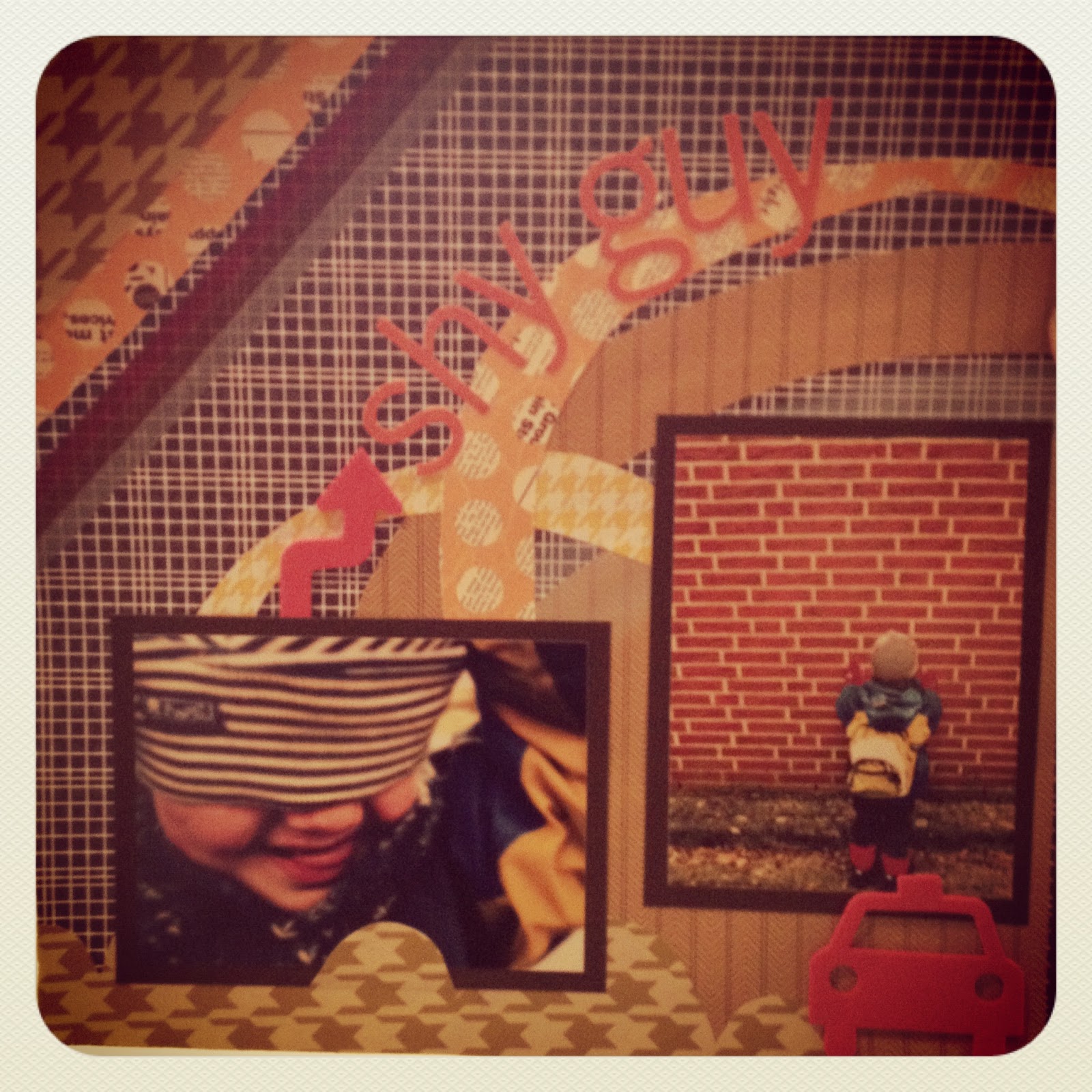
 one of my new favorite pages, ever.

probably the time where i get to be the most artsy and crafty is at work.
my kids are really independent and self sufficient so i'm not having to guide them during art 
[which i oppose of anyway] 
but this makes it so i am able to sit down with them sometimes and make art.
or, i just get to witness awesome three year old creativity all day long.

the last two weeks, the curriculum theme was transportation.
during the second half (last week) i focused on travel, and how we go places. 
i purchased u.s.a road maps and atlas' from the dollar section at target, and had the kids paint on them with watercolor. they turned out beautifully and i had them tell me something about maps. this quote was one of my favorites. three year old innocence is beautiful.

+++
that's most of the craftiness for now.
the blogging has been sporadic because we are moving this week and next week.
not far, just down the road actually, and i'm very excited for a new start and this charmingly, adorable, old house. but moving and packing and unpacking is a bit stressful, for sure. 
so i'll try to be around more often :)
xo, hay

Thursday, September 15, 2011

crayons+sun

When I saw it on Pinterest, I knew it had to be done.


It started out with a long canvas, some hot glue, and crayons.


Next: the hairdryer.
Which took for-ev-er.
After 10 minutes this is all that I was working with:
One little drip.

So I took it to the next level.
Dryer to crayon contact, and got this:

Which worked out but was making the wax fly all over the canvas and not really pouring out like Pinterest showed me it would.
I gave up and decided to put it in the backyard for a few hours since it's still in the 90's [sometimes 100's] up in hurrr.

Way better. 
Even better when I held it up and let it slide down the canvas.


The final product on my bedroom wall:


Verdict:
LOVE

Tuesday, September 13, 2011

since the beginning...

I have been a true artist.

The octopus is wanting his fish, shark, and scuba diving friends to wait for him.
Almost brings a tear to my eye.
I was 6 or 7 years old.
Think I might need to frame this bad boy.

Thursday, August 4, 2011

take me back to the louvre


One of the reasons I would like to give Paris a second go-around is the Louvre.
I am a major art nerd (future Art History teacher hopeful) and could get lost for days here among the ancient sculptures and masterpieces. 
When there four years ago, we only had half of a day to explore. We got off our red eye train from Berlin and walked straight into the Museum. Not ideal conditions for a day dedicated to art, but you take what you can get. 
I saw the Mona Lisa and was good and didn't take a picture (since it wasn't allowed...bad children who did) and got to pose next to one of my absolute favorites:
The Winged Victory, or, Nike
[seen above]
+ 
a particular Asian tourist felt the need to pose in my photo...sweet.
The architecture of the museum is drool worthy for architecture lovers like myself.
The collection, vast and inspiring.

The Louvre is a Paris must, and for some, like me, the main reason to visit...again!

Friday, June 17, 2011

be still.

please.

Monday, June 13, 2011

photo text: a tutorial

a few days ago i posted about celebrating 100 posts on this blog.
since then a few of you lovely readers have been asking about the photo text pieces i created.
i would love to share with you how i made them, and give you my first ever tutorial post!

so, first of all you will need a picnik account + be a premium member to use the features in this tutorial.
it's about $26.00 a year, and i can tell you that it is completely worth it.
i edit all of my photos through picnik, i don't have lightroom or photoshop, and i get some awesome results. 
i also make all of my headers or blog buttons there.
best $26.00 i have ever spent, for real.

alright so after you have set up your account, you will upload some photos, which is pretty easy and self explanatory...but after that click on the "collage" tab:

the best color for this project is black, which you will see in a few steps, so after selecting your size and color click on "done" in the upper right hand corner.

after clicking on "done" you will be taken to another screen with 5 tabs, the default is "create" and that is where you want to be.
under the five main tabs, select "text".


in the text box, type in whatever it is you'd like to show, and select a fun text. 
since you're a premium user you will have some pretty rad choices to choose from.
i find that thicker fonts work best, but almost all of them look awesome.
it also must be white. maybe a really pale pastel would work, but just know that it will give your photos a tint.
the best part about making things like this is experimenting, so have fun with it.


this is where it starts to get a bit confusing, so i'll try my best to explain it thoroughly.
 in the bottom left hand corner there will be a small tab labeled "photo basket".
click here to bring up the row of photos seen on the bottom of my screen.
[this option is only available to premium users, hence why you actually need a premium account to make this.]
now that your photo basket is up, select a photo you would like to use as your 'text'...which really is the background. drag your photo onto your banner like so ^.


the next step is to re-size and drag your photo[s] to your desired position. 
basically, place them over the text like so:
i chose to do multiple photos, all very colorful. 
you can do this, or choose one photo and expand it to cover the entire banner.
my banner is still there, just covered by the photos...make sense?


after all of your photos are in place, select them individually.
the little "photo properties" box will pop up.
under the "advanced blend modes" option, click on the arrow and select "darken"
this will alter your photo to make it look like it is behind the text/the text itself.
this is why black is best, the lighter the background color, the more photo you will see.
but i will show you that at the end...anyway,back to the tutorial.
do this technique for every photo on your banner/palette.


you will now have something that looks like this:
this is where you can position the photos however you would like, even change up the font if you don't like what you already have. if you wanted to edit or alter your photos in anyway, you will have to do that before you start, and in the step when you pull up the "photo basket" select the "history" option. the default is "get from computer"...but if your photos are already edited, from somewhere other than picnik, well then, you're good to go.

really hope this is still making sense....

once everything is in place and you are in love with your cool new project, click on the "edit" tab.
once there, select "resize".
i prefer 800x272, but you can pick whatever you'd like for your blog, card, poster, whatever.
picnik also has "crop" options that let you resize projects into different social networking sizes, and even to fit your desktop.


next up,  click on the tab labeled "save & share".
then, just give it a title and save it to your desired location.
you are now all finished, yay!
my finished project:

and that is it.
i really hope this explains it correctly, but if you have any questions about anything just leave a comment or shoot me an email.
also, if you don't want a premium account, i would be willing to help you out.

if you are interested, send me and email with 1-10 photos you'd like to use and a description of what you are looking for. right now i will be doing blog buttons, or banners.
since i just got started doing this myself, i wont be charging anything for this and i can promise to get you your finished projects back within 5 days of receiving your photos.
all i ask in return is that you do a post linking back to me about your new banner or button. 
or a permanent 
"banner made by see.hay.fly" 
visible on your blog, linking back.

get this while it's hot!
a.k.a before i start charging people for designs :)

here is a look at different fonts and colors:

as you can see, black is best, but navy, forest green, and plum work pretty well too.
the top grey shades weren't even that light, but you can still see the picture very clearly.
this is really just a small portion of font choices, head over to picnik and check it out.
you can also get a free account there, which comes with some neat features, but i think you'll want to become premium very soon after :)


*please note that this is my individual tutorial and ideas and is in no way sponsored picnik.com, even if i would like it to be* 

Thursday, June 9, 2011

one hundred.

you guys,
this is my 100th post on this blog.
i would love to have some sort of awesome '100th post' type of post, but i wont lie to you.
i don't.
but i did make a pretty picture...with some of my favorite pictures...yay.

here it is, sans font:

and while i was at it...i figured,
'why not make some cool shizz?'

i love this one:

so then...
i decided i needed to make a new banner, for when i go home:


but then i was having so much fun i decided i should make some more:


umm, now i can't decide which one i like most.
i'd love to hear your thoughts.
and speaking of you, you readers, thanks for sticking around for 100 posts!
i love this little blog and all of the "internet friends" i've made through it.
(is there a way to phrase that without sounding creepy?)
anywho, really though, i can't wait to continue see.hay.fly even though my german adventure is coming to an end. i can't wait to revamp this space, and add some cool new features and weekly themed posts. stay tuned, you guys rock!

party on wayne,
-hay

Tuesday, February 22, 2011

scholarly tot....


oh.em.gee.
it's fricken cold.
like, the kind of cold where the wind chill is so fierce that you kind of want to stop moving and just cry.
but if someone really did that, their tears might freeze, just saying.
no, but really. the sun has been shining, but it is icy cold out there.
the kind that gives you headaches.
needless to say, we have been taking the bus to kindergarten, not walking.
unfortunately.


we came home, into the warmth and got right to painting. his idea.
perfect idea.
his concentration is so great, i love seeing this look on his face.
+++
here he is working on his gun painting.
all boy, all boy.


does anyone else drool over brand new art supplies?
or is that just me?


handsome little man.
-------------------------------------------
while i cleaned up the art mess, this little one went to play in his room.
when it was way to quiet, i went to see what was up...

me: "was machst du?"
what are you doing?
him: "ich mache hausaufgaben in meinem büro."
i'm doing homework in my office.
me: "super! kann ich kommen?"
nice! can i come?
him: "Ja, bitte. aber das ist MEIN büro!"
yes, please. but this is MY office!


 first it was just the learn to read book...

but then there were more.
please take note to the laptops.
not one, but two.
plus his cassette player, and cassette collection.
 there was a mini break for animal fights.
++++++++++++++++++++++++++++++++++++++
i was left to do things like this:
[the second one is for kendall...i'm not a weirdo, but together, we are weird]


++++++++++++++++++++++++++++++++++++++++++++
day ten:
songs you listen to when you are happy, sad, bored, hyped, mad
this is hard because i like a ton of music.
emphasis on the ton.

but some of my go to playlists for happy music include:
matt & kim
edward sharpe and the magnetic zeros
the temper trap
the darkness
the beatles
metric
she & him
MGMT

i don't listen to music when i'm sad.
it usually makes it worse.
but listening to ingrid michaelson's cd-be okay will make you sad.
i think it was written after a break up.
same with mumford & sons
as well as florence and the machine.
i love all of it, but it will bring up some memories of break ups.

bored music.
a.k.a
mellow mix
that would include:
grizzly bear
fleet foxes
band of horses
sufjan stevens
death cab for cutie
aqualung
johns mayer
the shins
the xx

music for when i'm hyped.
hmmm maybe a little bit of:
neon trees
the killers
gossip
30 seconds to mars
red hot chili peppers
my chemical romance (new cd is bomb.com!)
and of course the ever so hip katy perry, cee lo green, and bruno mars :)

and when i'm angry, i listen to classical music, spanish guitar, or movie scores.
it seriously helps.
if you're angry, do it.
+++++++++++++++++++++++++++++++
peace out, loves.
as i write this i'm nursing a sore throat and fever that showed up out of nowhere like they own the joint, so i'll be asleep in three...two...one.
guten nacht.